

A few weeks ago, our client at a research institute sent us a draft of their new proposed website structure, written by one of its departments. The draft gave that department eight sections of its own, and about half of them linked to pages the whole institute shares. The covering note asked us to make the final structure feel fair to every department.
I see this in almost every website redesign we run. Each department head wants their department to be visible on the site, and each one gets a say when the structure is signed off. So even though Marketing owns the website, they have to manage these senior leaders while they compete for space on the brand site. As a consequence, the website navigation structure ends up showing who won that argument, rather than what visitors came to do.
The menu is only the part you can see. Underneath it sits the information architecture: which pages exist, how they are grouped and named, and which paths lead a visitor from a question to a decision. When departments negotiate the menu, they are really deciding all of that, without realising the impact this will have on the user experience.
This post covers M, Meaningful User Experience, the third of the seven COMPASS pillars. This pillar advices marketing team to build their website's information architecture around how visitors make decisions, and how to come to a consensus with stakeholder by relying on visitor evidence before the actual website design even starts.
How the org chart gets into the structure
When the draft structure goes round for approval, each department head checks one thing: is my department visible? A department left out of the top level pushes back, while a department already there has no reason to object. So every round of review adds sections, and almost none take any away.
Nielsen Norman Group, a UX research firm, says a site that copies your org chart "may make perfect sense to its creators, but it won't make sense to the intended audiences". Your visitors don't know your org chart, and they don't care about it. Jakob Nielsen warned about this mistake in June 1997, and it is still common nearly 30 years later because the approval process continues to reward it.
Department names cause a second problem, because they are internal language. A department's name, a unit's name or a programme title means something to the staff who use it every day, but it tells a visitor very little about what its really about. So visitors click and guess, and the ones in a hurry simply leave.
The cost is higher now, because most B2B buyers prefer to do their research alone. A June 2025 Gartner survey found 61% of B2B buyers prefer to buy without a sales rep. In a 2023 Forrester study for Google, 49% of US B2B buyers said finding information was their biggest problem when dealing with vendors online.

What the negotiation looked like at a research institute
Over two months, the institute's team sent us five versions of its new site structure. By the latest one, a third department had its own place at the top level, even though it has no section on today's website, and the pages under it were copied word for word from another department's. Departments now hold three of the eight top-level slots, each labelled with the department's own name, and the draft lists three new research themes above the four old programme names, which are still there too.
However, the visitor data points the other way. Over the past year, the two departments that do have sections on today's site drew under 5% of all visits between them. Staff profiles drew about 13% on their own, yet the latest draft buries these staff profiles four levels down.
Early on, our strategist warned that a structure built for visitors would probably have to take department names out of the top level, and that the departments were unlikely to agree. The institute's communications team is stuck in the middle, between senior colleagues who each have a fair case.
Let visitor evidence settle the structure
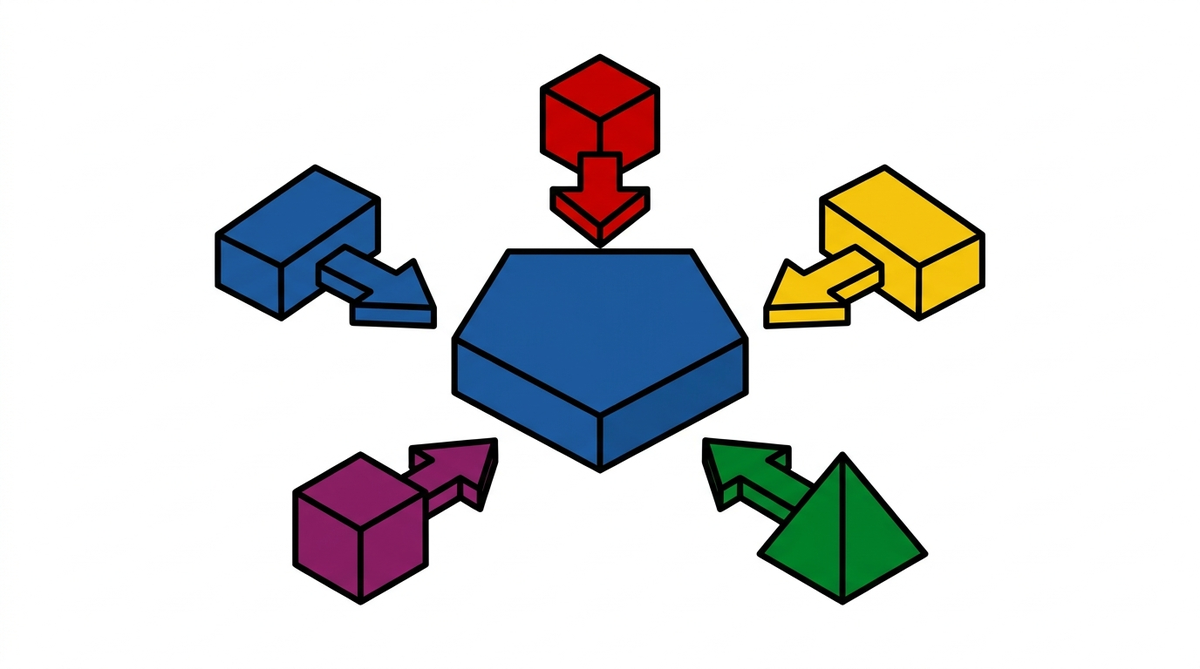
An org-chart site comes from how decisions get made, so the fix is to change what department heads argue about: what visitors need, instead of whose section sits where.
This is how we usually help resolve that tension. We start with the evidence: we read the analytics for each audience, survey those audiences when the budget allows, and go through the current site as each type of visitor, noting where they get stuck. From that, we draft a proposed structure.
Before the senior group ever meets, Construct Digital takes that draft to each department head one to one. We ask what they need from the site and where they see problems, and because it is a private conversation, each of them feels heard. As much of that feedback as possible goes into the draft before the workshop.
So when everyone sees the structure together, most of their concerns are already answered, and agreement comes far more easily. Only the genuinely contentious points are left to settle, and for each one we bring our own recommendation, backed by the visitor data.
When the budget includes it, a card sort or tree test then checks the new structure with real users. A tree test needs no design, copy or code, so it can run early (Nielsen Norman Group, 2023). The structure is agreed in writing before any page is designed, so departments can't reopen it one at a time. When the next request for a top-level slot comes in, you can say no by pointing at what visitors actually did.

What a clear path per visitor did at a trade show
At Construct Digital, we rebuilt the website of an international trade show around its three audiences: exhibitors, visitors and media. Each one got its own way in from the homepage and the top menu, and the exhibitor page put the visitor numbers that exhibitors check before booking a stand near the top.
Comparing January to June 2019 with the same months in 2023, bounce rate fell from 47.56% to 36.51%, and the average visit grew from 4 minutes 23 seconds to 5 minutes 25 seconds. A lot changed in that rebuild, but we credit those two numbers to giving each type of visitor a clear path.
A ten-minute check on your own site
1. Read your top menu out loud to someone outside your organisation. If they can't tell you what sits behind a label, that item serves someone inside your organisation rather than your visitors. 2. Find your ten most-visited pages. If they sit under sections few people open, your site was built for the people who approved it.
FAQ
How should website navigation be structured?
Around the decisions your visitors are trying to make, with the pages they use most closest to the homepage. The harder part is usually getting department heads to agree to it.
What are card sorting and tree testing?
Card sorting asks users to group your content in the way that makes sense to them. Tree testing asks them to find things in a proposed structure, to check it works before anything is designed.
How do we stop every department asking for a top-level slot?
Build a proposed structure from visitor data, then talk it through with each department head one to one and fold in as much of their feedback as you can. Bring only the contentious points to the group workshop, each with a recommendation backed by the data, and agree the structure in writing.
Build the site for the people who arrive
That department's draft made perfect sense to the people who wrote it. If departments are negotiating your site structure, COMPASS puts visitor evidence in front of every department head before the structure is agreed, so it works for the people who visit as well as the people who sign it off.
---
Score Your Website
Twenty-one questions, about six minutes. See how your website scores against the seven pillars of COMPASS, and get a pillar-by-pillar report you can put in front of leadership.