Content Outline
As an agency that espouses good digital content, we take design very seriously. Far from being just an ornament or an icing on your brand, good design is in fact your identity, being communicated visually. whether you're an individual, brand or even a government body.
So, when we saw the newly enacted Philippine National Identification System mockups, we couldn't help chiming in.
We see this as a missed opportunity for a government to communicate and solidify a national design identity, through something so monumentally significant. That, and our talented Filipino designers would probably need to see how other countries are doing it to give their creativity a good kick.
Note that everything shared in this article focuses squarely on design, and is done in the hope of pushing further the envelope on Philippine design standards.
The Current Proposed Design of the Philippine National ID
Before we share our own design, let’s recap what’s been making the rounds on social media, the national mock-up. While there is nothing technically wrong with the card, and while it does look functional, we feel the card falls short of communicating visually the Philippine’s design aesthetic. This is because of five things:

Photo courtesy of @wengsalvacion
1. Dated Design
The design harkens back to a time when designers had limited tools (PowerPoint, anyone?) at their disposal. There is also inconsistency in terms of the design treatments being applied—going from gradients, to fractal, and then onto some solid colours.
2. Usage of Random Colours
The chaotic colour scheme fails to communicate the Filipino identity that is prevalent in our national flag colours, nor does it harmonise design-wise with other national items (such as our all-maroon passport). Usage and introduction of new colours is fine, if there were some sort of colour logic followed or applied, but that escapes us.
3. Design Noise
There are too many elements in the background jutting out into the foreground, and this only muddies key information that needs to be consumed by the design consumer.
4. Typography
There is no proper use of line and letter spacing, making the card look really busy.
5. Too Much Information
We get that this card serves multiple purposes and hence requires a given amount of information, but is your place of birth really something you need in front of the card?
What Others Are Doing (Taking Design Cues From Countries That’ve Got Their National Design and Identity Down to a Pat)
Now, let’s take a trip to Europe to see how others are winning at their national design identity.
Renowned Norwegian Design.
Lets take for example the Norwegians, who are admired by designers the world over for their clean, functional, and modern national design, permeating their passports and national currency.
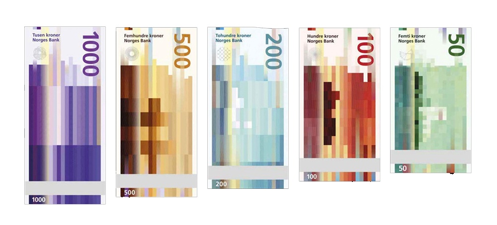
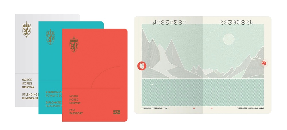
The clean minimal design is not just pleasant to look at, but also congruent in the design principles being applied. It doesn't shift drastically in style from one treatment to another.
Naturally, this national design aesthetic also applies to their national IDs.
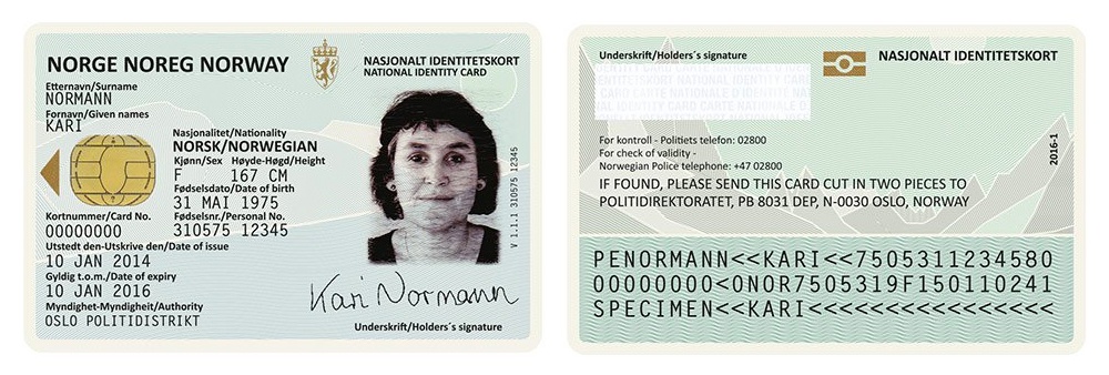 Photos courtesy of says.com
Their emphasis on creating a unified design for their national collaterals communicates the idea that Norway is a modern country, who push design boundaries, and put large emphasis on national design.
What about greater Europe?
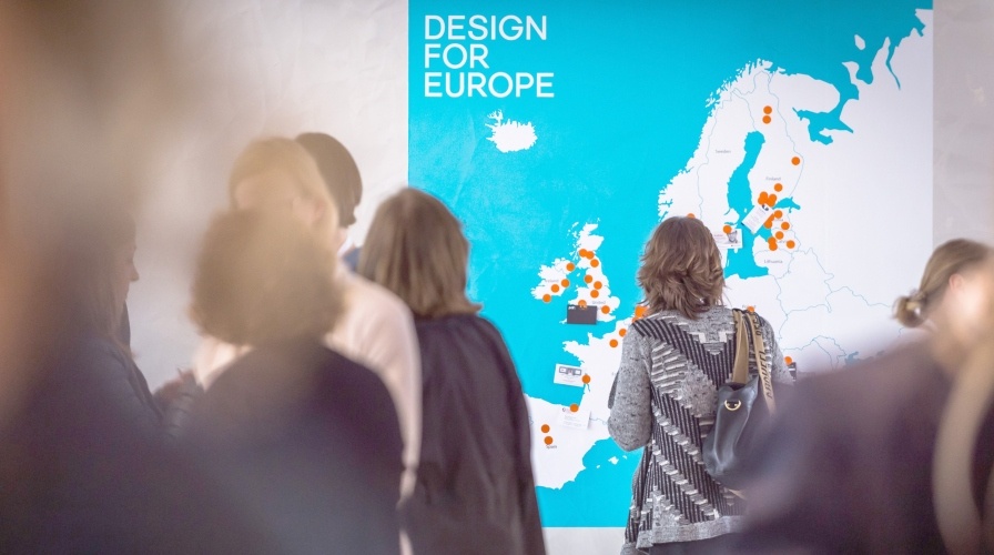
Photo courtesy of ADP
Europe is known to take their collective design seriously as a continent. In January 2014, a three-year initiative called Design For Europe, created as part of the European Commission’s Action Plan for Design-Driven Innovation in the continent, was started.
Why is this important?
Innovation in design has been cited as an important driver in development and improvement. According to the UK Government blog, Innovate UK, “it is design that determines how the end-user will experience, interact with and generally respond... As such, design will play a role in determining what will be purchased and how much will be spent on it, what will become high-demand, what will be deemed essential and so on.”
In essence, good design goes beyond simply making things look good. They have impact beyond just beautifying objects, too.
The New and Improved Design Mockups
With all that said, we are proud to present mock-ups for the Philippine National ID system.
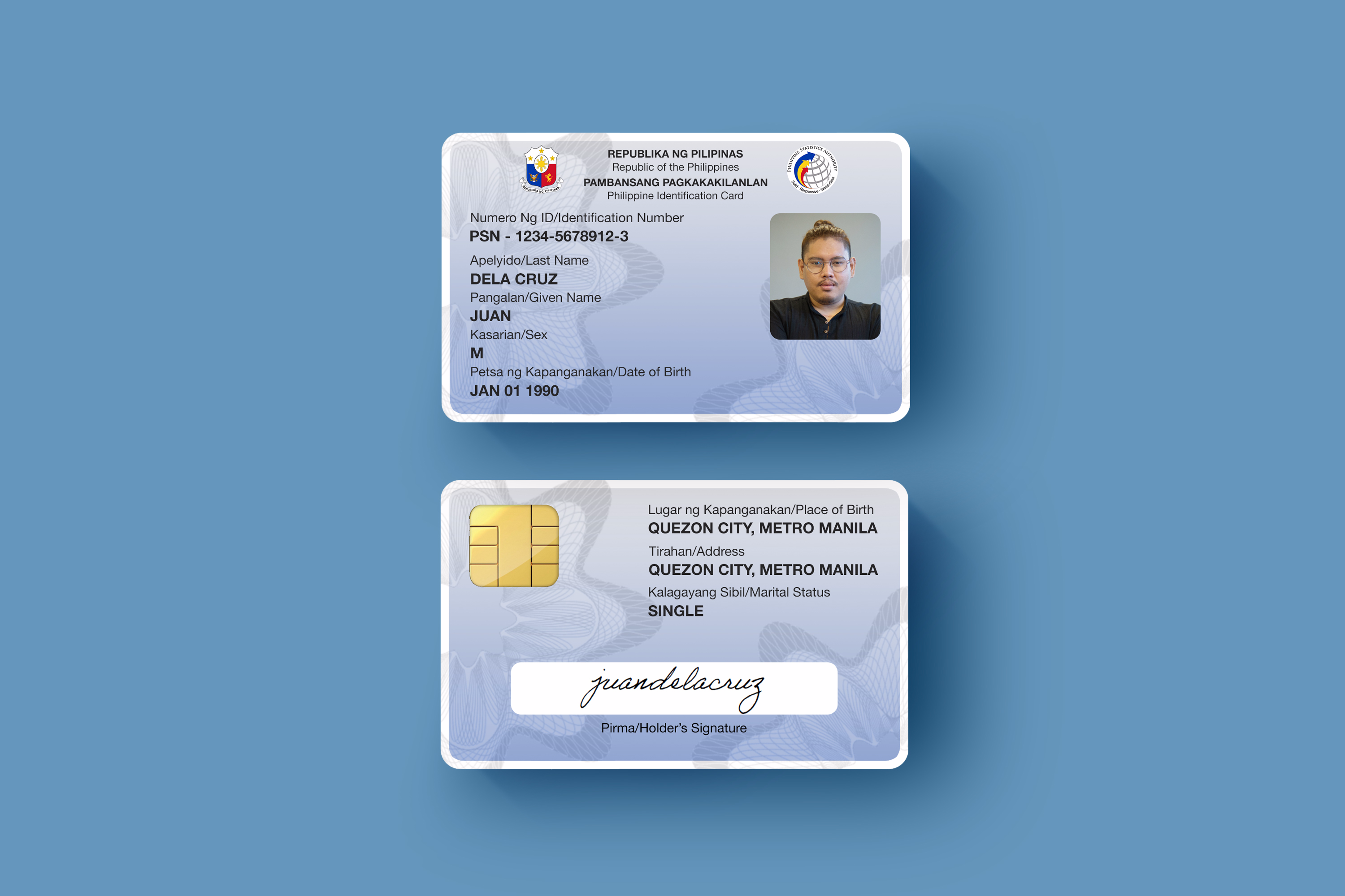
1. Concept design: adapting the current design and features into something that takes cues from our national colours, using a standard colour logic, and balancing out the different elements.
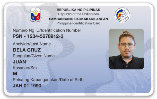
We pushed non-essential content to the back, saving the front for key details, producing a cleaner layout. We used one standard colour, blue, in reference to it being one of the Philippines national colours. We also fixed the 5 issues we previously identified.
Too plain?
Our next concept is a more adventurous and modern interpretation of what we envision for the card.
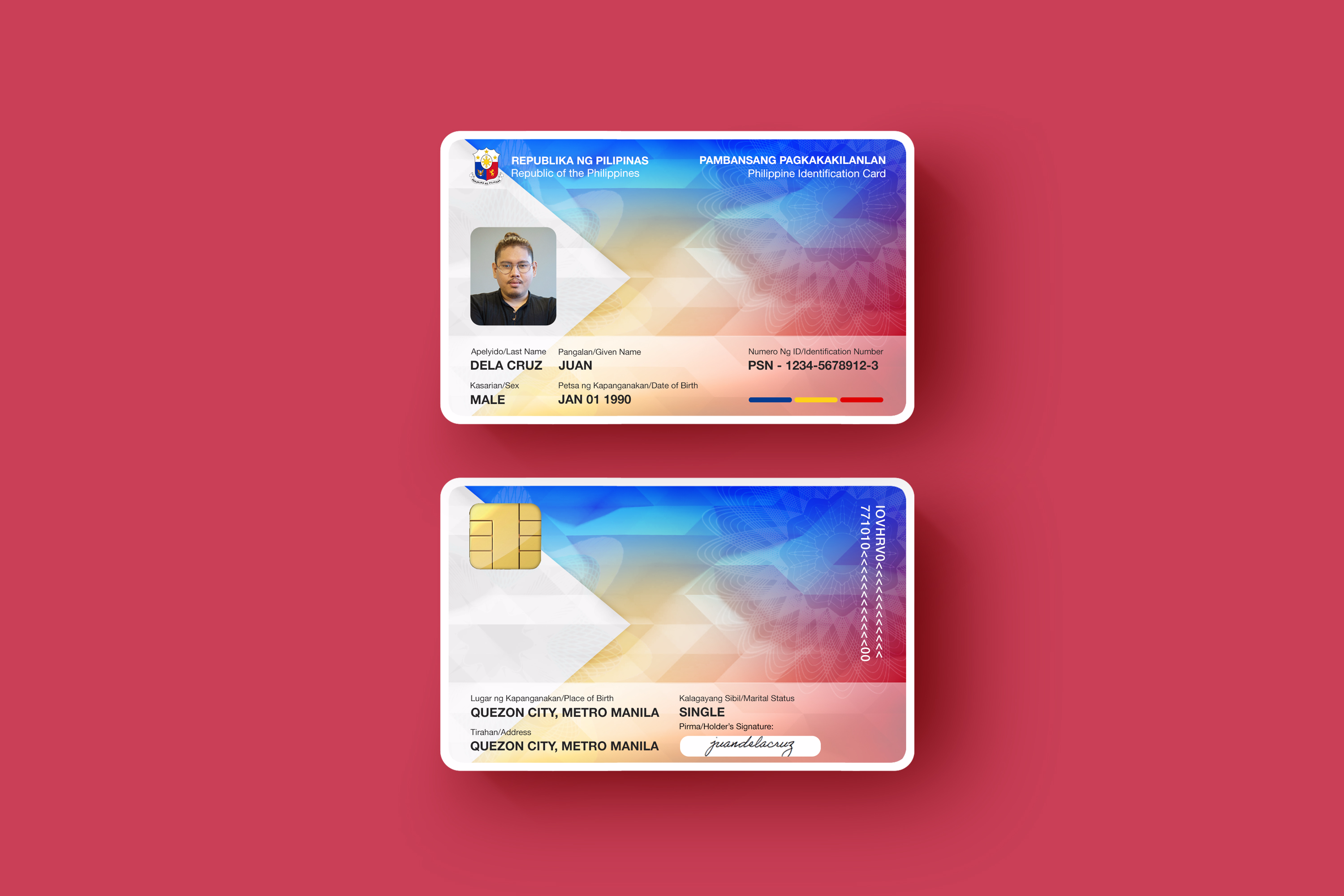
2. Concept design: aesthetically modern but still in line with existing national design aesthetics.
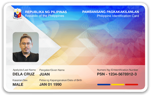
We applied the same considerations as our first mock-up, but placed greater emphasis on using employing negative space to serve as design elements, while incorporating the outline of the Philippine national flag.
Once again, we stress that these designs are done purely as an exercise of creativity and as an expression of our design aesthetic. We are not privy to internal information that led to design choices nor other additional requirements. Ultimately, what we’re trying to say is, while design is subjective (you might hate our version too), there are rules to good design that is almost-universal.
Like the concepts? Hate it? Let us know what you think below, and share this on social media with a friend.

About the Author

Jan Mascarina
I'm Jan, internal marketer for Construct Digital. I have over 8 years of marketing and communications experience, spanning publishing, gaming, client-end and of course, digital. I make sure the things on this website work right, and that we're delivering content that matters to you - our reader. I am obsessed with mobile technology, UX, and my cat.

Guide
Assess Your IMPACT
Try our IMPACT scorecard to discover how your marketing stacks up across our six-pillar framework. Get a data-driven scorecard that identifies gaps and opportunities for measurable growth.