Content Outline
Different customers behave differently toward the different kinds of promotional content they see online. Be it a downloadable resource on fixing leaky pipes, or a 5-minute explainer video on clearing your sentimental clutter (insert Marie Kondo quote here), your customers’ actions are always dictated by their pain points. As such, how you frame your solutions will always be a key determiner of the effectiveness of your offer.
Same goes when creating CTAs (or calls-to-action) that truly drive web conversions. In this article, we explore the different elements of a CTA that you should know.
To capture your readers’ interest, you will need to analyse audience behaviour over time. Specifically, you’ll need to note how they react to changes you’ve made, like page placement, colours, text length, typography, etc.
This practice is also called A/B testing. It is a practice that is today commonplace among web developers and marketers - testing different elements on their site. Based on our observations, however, this practice seems to be sometimes-overlooked when it comes to the CTAs themselves.
Technically speaking, A/B testing refers to the process of using two or more versions of the same thing, presenting the various versions to a defined sample of your target audience, and identifying their reaction to the change in variable. In a nutshell, it’s comparing two versions of a website element and analysing which one performs better. It is a form of data-backed decision-making, where the thing that performs better numerically is then used moving forward,
Now that's out of the way, lets get back to CTAs. To use A/B testing to determine what kind of CTA gets you the best result, you’d need to know what you can change and actually put to test within CTAs. So first things first—what are the elements that make an effective and compelling CTA?
Here are a few things to consider.
The elements of killer Call to Actions (CTAs).

1. Considerate choice of words: the actual copy within your CTA.
 Your CTAs are meant to get your visitors from one part of their marketing journey to another (ideally, moving them further down a marketing funnel). It’s essential to use action-oriented language to create that sense of urgency. Keep the CTA button to a maximum of 5 words and use terms that elicit a reaction from your audience in the copy.
"Last Chance Today", "Hurry", and "Offer Ends in 2 Hours" give a persuasive ring to your CTAs, while "Guarantee", "Proven", "Free" and "Save" convey value for your readers.
A surefire trick for creating effective copy for your CTAs? Precisely identify the value proposition of your call-through, and structure it in such a way that your readers know exactly what they get once they click the button.
Find out more about Digital Marketing the downloadable content right.
Download now.
vs
Exclusive 11-page downloadable guide to Digital Marketing now available FREE for a limited 24 hours!
Download now.
Looking at the sample generic CTAs presented above? Which one compels you to click through more? We'd bet, the second one, as it tells you exactly what you're getting, and imposes a time limit in which you can act, instilling a sense of urgency and invoking the user's fear of missing out.
2. Use intentional visual and design cues that make your CTA stand out.
Poorly designed CTAs can get lost in a sea of text and other competing visuals on the webpage. It’s important, then, that your CTAs stand out and call attention to what you’re offering to your viewers.
 Good marketers know this: CTAs must be designed as buttons—not treated as hyperlinks. This way, your readers know they’re getting something of value when they click it, instead of just being linked to another page on the website. It is often a clear visual break, designed to intentionally break and stand out from whatever collateral you're currently browsing or consuming.
At times, this could mean that CTAs fill the entire screen, or even that the entire design is considered and created in such a way that it leads the user visually to a CTA, or even directly point to the CTA. Check out the cool button image example, courtesy of UX Planet.
3. Placement of CTAs at tactical locations within your collateral.

Different content formats call for different placement of CTAs on the page. But when it comes to getting your viewers’ attention, it’s best to design the CTA across the entire width of a post body column and to the columnar width of a web page to get the eyeballs you’ve been wanting. That’s about 650 pixels wide, according to HubSpot.
- HubSpot adds that placing CTAs this way gives you higher chances of disrupting the F-shaped scanning pattern of viewers. F what? This just describes how the eyeballs of the average person typically move when viewing badly designed web pages: they gaze on the first lines of text on a page, and the first few words on the left of each line of text.
4. Usage of standout or highlight colours to bring attention to your CTA.
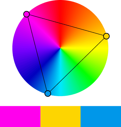 An example of a Triadic colour scheme on the colour wheel
Image taken from Wikipedia, by Weegaweek, CC BY-SA 4.0, Link
If you only have room for one piece of advice when crafting your CTAs, remember this: make sure your CTAs pop from the rest of the page. And what better way to do that than to use bold colours and highly contrasting designs?
Remember: Don’t go for button colour that exhibits low-contrast against your background colour. If your webpage is predominantly red, choose green buttons. If your infographic is in blue, opt for orange. The colour wheel should guide you here.
Another trick is to use the triadic colour, or “one that is a third of the way around the colour wheel from your dominant colour”. Using this colour scheme gives vibrancy to key elements on your website, while maintaining harmony and continuity in design.
Caveat alert: If you’re using, say, blue as your CTA buttons, they need at the least to be consistent throughout your pages. Whatever colour you assign to your buttons will automatically be associated with the action you want taken by your readers.
Use these points to supercharge your CTAs today.
In the world of digital marketing, CTAs will always be your main conversion point—if and when done right. To increase click-through rates, go for strong visuals and use words that clearly communicate the unique value of your offer. Make sure to also A/B test your buttons every run of your campaign to see which text and design changes are driving engagement with your audience.
- - -
To learn all about crafting CTAs that convert, check out our free resource: 'ABCTA: The Ultimate Handbook to Call-To-Actions (CTAs)'. Learn the fundamental principles of CTAs, and understand how to deploy them effectively for your business today.

Click the banner above to download our CTA handbook today!
About the Author

Ronn Angeles
Ronn Andrew Angeles holds a Bachelor of Arts in English Studies degree from the University of the Philippines, where he is also completing his Master of Arts in Creative Writing. Prior to joining Construct Digital, he has served as a public relations Officer, communications officer, and training instructor for both private and public offices.

Guide
Assess Your IMPACT
Try our IMPACT scorecard to discover how your marketing stacks up across our six-pillar framework. Get a data-driven scorecard that identifies gaps and opportunities for measurable growth.