Content Outline
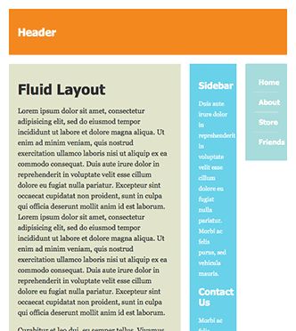
Alfred talked about Responsive web design in an earlier article and since then we’ve been having lots of fun with Responsive web designs on our projects. Today we thought it might be useful to share some of the resources that we used to get us started on our responsive design journey.
Framework – BootStrap from Twitter
There are a number of frameworks to choose from when getting started, but we really liked Bootstrap from Twitter. It has everything you’ll need to get going, including a responsive grid system, Jquery and all the useful plugins you’ll need to deliver cross platform goodness.
Tutorial – Responsive Web Design Demystified
This in-depth tutorial builds a responsive template and discusses the key design considerations when moving from a non-responsive layout to a cross-platform friendly layout.
Video – Responsive Web Design: A Visual Guide
If you’re more of a visual person and would rather check out a video tutorial then NetTuts has got just the thing for you. This 30 min video tutorial covers Media Queries and some great examples.
Testing – Screenfly & ResponsivePX
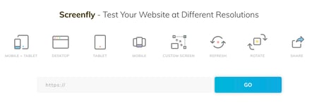
ScreenFly and ResponsivePX are simple but effective tools to easily test your responsive web designs in different viewports. I particularly like the wide range of preset screen sizes available in Screenfly.
Once you’ve worked thru the above resources, you should be able to quickly reuse your current code base to get your web site working charmingly well on mobiles and the iPad.
We specialise in responsive website design and development in Singapore. Call us if you want to modernise your website design.
About the Author

Charanjit Singh
I help SEA B2B Marketing Leaders cut Cost-per-Lead 20-40 % with the I.M.P.A.C.T.™ framework

Guide
Assess Your IMPACT
Try our IMPACT scorecard to discover how your marketing stacks up across our six-pillar framework. Get a data-driven scorecard that identifies gaps and opportunities for measurable growth.